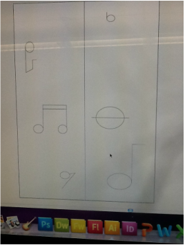
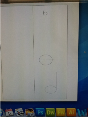
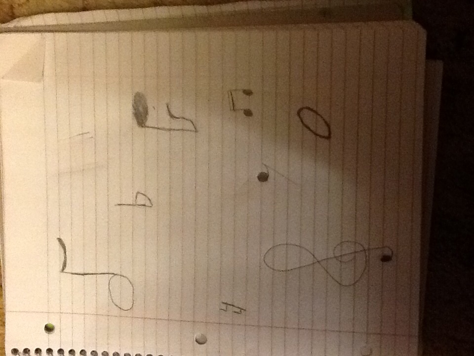
So far the main shapes of the notes are going well, but I'm having a hard time getting some of the lines to curve. I am adding too many anchor points. I tried redoing the shapes that needed less anchor points, but then I couldn't get the shape back to how it was. I decided to use the pencil tool to make the curves. I decided to not do the treble clef and do bass clef because that was the hardest thing that I was doing.
I am using colors to express the negative and positive influences music has on people. I have chose to use bright colors for the positive side and darker colors for the negatives. I want the colors to mix together in the middle so the colors blend to make the next color. I have to make different shapes and sizes for my information bubbles. There are a lot of curves in my project, so for the curved lines I am going to use my anchor points to make the curves look good.
So far the camouflage basketball and the words are going good. I am having a hard time with drawing the drone because I am not good at drawing planes. The shape doesn't look right, so I just made the drone look like and airplane and add features to it to make it look like a drone. Instead of having a camouflage basketball in the background I made the "o" in drones look like a basketball and made it camouflage. When I am able to work on a computer I will add more detail and make the "o" look better, as well as the drone.
For my info graphic I am showing the statistics of how different kinds of music can influence people. I have designed my lay out and found information. My information bubbles are going to be in the shapes of music notes and things that relate to music. I am also looking at how music has changed over the years and how it changed people's attitudes, I have a personal connection to music. I grew up listening to music because my dad is a musican, I'm also in band. Because I grew up around music I alread have some background information. I want my project to inform people about music and how it influences people.
I have started working on my final product. I haven't started working on the computer yet due to technical difficulties, but i have started it on my iPad. The base of my candle is going the way I want it to, but I still haven't found a font yet and I am having problems making the flame of the candle the right shape. I have tried drawing it by hand,but It is too big or too round. I will use the pen tool to make it look like it suppose to when I work on the computer. I decided to make some of the letters in my quote and the back ground look lighter so that it looks like there is light coming form the flame. This change will connect to the quote more and hopefully connect to the people looking at my poster.
I finished my final draft, but I still need to find a font to use. I did my final draft on my iPad using an app called nue. Annotate. I used that app because it was the only app that i found that had graph paper. I used the graph to make my lines straight. I first did the outline of my candle and filled it in, then after I finished the base of my candle I had to make the flame, which for me was the hardest part. I filled the rest of the empty space with black and typed my quote in a red font color.I tried to draw the flame by hand,but it didn't look right so i just made a curved square to make it look better. It still doesn't look as good as it should, but when I start working on the computer it will look like it should.
When we started the project I knew exactly what quote I was gonna do. I want to use a font that will relate to my quote.I want to have a font that is old and elegant. I want to use a quote that related to me and expressed how i feel and it came from my favorite movies/books, Harry Potter. I found a free font that looks like the font used for the Harry Potter titles. Since my quote is talking about finding happiness I decided to have a picture of a candle in the back ground. I hope this art work connects to other people and that other artists like it as well.
I learned that even though you have one main design you have to use multiple elements of design. I tried expressing myself though my project, but I didn't do it very well. I stuck to doing one element instead of doing all of them. If I drew my project on paper I wouldn't of done as good as i did. I tried using gradient in only some of the grouped rounded rectangles ,but when my project was critiqued the person who critiqued it didn't like it so I changed it. I changed all the grouped rounded rectangles and made sure they were all gradient.
Hey, these pictures show the amount of progress I have made so far. So far I have done tutorials 1-12 and I am going to continue on to 13-18. These episodes taught me how to use illustrator on an Apple computer.The easiest part for me was the shape vector, it was easy because it taught me how to make a basic shape and also how to change that basic shape. The hardest part was the pen and pencil tool because it took a lot of time to create a picture and make changes. I don't have a very steady hand when it comes to drawing, but doing it on a computer helped me draw virtually. Drawing virtually helped me draw better with paper and pencil. I have a steadier hand and i can draw better.
|
AuthorWrite something about yourself. No need to be fancy, just an overview. Archives
December 2014
Categories |